Chat User Interface Design – A Quick Introduction to Chat UI
User-friendly and accessible chat UI design is essential for modern applications, as it significantly impacts the user experience and overall satisfaction with the product or a service. With the right approach and tools, you can create a chat user interface that enhances communication and engagement for your application.
Design accurate prototypes replicating the final messaging app experience, including fully functioning forms and advanced interactivity. Sign up for a free trial to build your first interactive prototype with UXPin.
What is Chat UI?
Chat UI (User Interface) is the design and layout for a chat application. These applications range from peer-to-peer messaging like WhatsApp and Slack to web chat (live chat) between company representatives and users, like Intercom and Zendesk.
Web chat applications are typically found on websites and digital products and enable users to chat with a company representative or leave a message for a response via email.
Web chat UIs have evolved significantly over the last decade and now have many features beyond communication, including documentation, FAQs, and other widgets. Organizations use these chat applications to streamline customer service and give users a user-friendly support experience.
Peer-to-peer chat has also come a long way. People use apps like WhatsApp, Slack, Facebook Messager, and social media DMs for personal and professional conversations, including video calling and the ability to send images, documents, videos, and other attachments.
Chat App UI Design Elements & Patterns
Here are some key elements to consider when designing an intuitive, user-friendly chat app.
Input field
Input fields are vital for chat applications because they allow users to type and send messages. Chat inputs must be easy to access (with both mouse and thumb/finger) and allow multiline editing. If the text remains on one line, the user can’t see the entirety of their message for review and editing purposes before sending.
Send button
The chat app must have a button or icon to send a message. The device’s keyboard (web or mobile) is also helpful for submission, like the “Enter” key on a desktop keyboard, so users don’t have to reach for their mouse and click “Send.”
Message bubbles
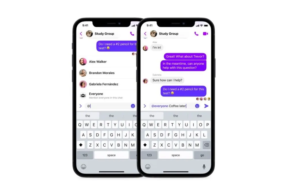
Message bubbles help users distinguish their message from others. These bubbles are particularly helpful for group chats with multiple users. Apps usually use different colors for the sender and receiver’s messages so users can differentiate between them.
Timestamps
Timestamps indicate the date and time when a message was sent or received. These UI elements are crucial for users to derive timelines, context, and timing and can help resolve disputes.
Avatars
Avatars or profile pictures had a human touch to chat UIs, reminding users of the person they’re communicating with. These are particularly helpful for group chats with many users, as it allows people to differentiate members simply by their avatar, making messages easier to scan.
Typing indicators
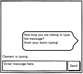
Typing indicators tell users when someone is entering a message. These UI elements are helpful if the user is expecting a reply or to avoid sending multiple messages simultaneously.
Error Handling for Chat User Interface Design
Error handling is crucial for chat UIs. It lets users know when something is wrong and how to fix it. These error messages can also avoid misunderstandings and conflicts. For example, imagine you send an important message, and it fails to send, but the app doesn’t inform you.
Here are some tips for UX designers regarding error handling for chat UIs:
- Appropriate placement: Position error messages close to relevant UI elements so users can identify the issue. For example, a bold red exclamation mark and failed error message draw attention to the bubble that didn’t get sent.
- Actionable feedback: Provide clear instructions about the failure and its cause. For example, “Unable to send! Poor network connection” informs users there may be an issue with their WiFi or data.
- Retry mechanisms: Implement functionality for users to fix a problem quickly, i.e., offering a “Resend” button next to the error to avoid retyping the message.
Designing Chat UIs for Chatbots
Set clear expectations
Inform users that they’re talking to a chatbot immediately with its purpose, capabilities, and limitations so they understand what to expect. There’s nothing more frustrating than typing a long message only to be greeted by a chatbot that can’t understand the problem.
Quick responses and actions
Offer suggestions, prompts, and examples to help users navigate the conversation and fully leverage the chatbot’s capabilities. For example, instead of “how can I help you?” provide a list of categories to narrow down the user’s problem and offer suggestions within each category to get a solution faster with as little typing required as possible.
Create a conversational flow
Design the conversational flow to feel natural and engaging, like the user is speaking with another human. AI models like ChatGPT and IBM’s Watson are excellent at mimicking conversational flow and providing succinct, helpful responses.
Ask for feedback
Feedback can help enhance chatbot experiences and refine language models. Ask users to review the chatbot’s performance and report issues at the end of the conversation to iterate and improve its functionality and user experience.
Chat UI Design Accessibility

Accessibility is vital for designing inclusive chat user interfaces that accommodate users with various disabilities, including visual, auditory, cognitive, and motor impairments.
Here are some guidelines for designing accessible chat user interfaces:
- Support for assistive technologies: The first step is to ensure chat UIs are compatible with assistive technologies, including screen readers, magnifiers, and speech recognition software, so that all users can engage in conversations.
- Use high-contrast colors: Choose colors that create sufficient contrast for users with visual impairments or color blindness to read text. UXPin offers built-in accessibility tools to help designers test UIs on the fly without leaving the design canvas.
- Use legible text: Legibility is vital for chat UIs. Designers must choose a readable typeface with sufficient text size. Using native fonts is the best option to avoid readability issues.
- Keyboard navigation: Ensure that users can operate and navigate chat UIs using their keyboard. This functionality helps users with cognitive disabilities and makes it easier for screen readers to use chat UIs.
- ARIA (Accessible Rich Internet Applications): Utilize ARIA attributes to provide context and information for users who rely on assistive technologies.
- Clear and concise instructions: Provide users with straightforward instructions and use plain language for labels. For example, there’s no need to get creative with naming the “Send” button, as this will confuse people.
- Offer customization: Allow users to customize chat UIs, most importantly text size, font (serif or sans serif), and color schemes so they can adapt the interface to meet their preferences.
- Touch target size: Ensure that touch targets for interactive elements are large enough and users with motor impairments can use them.
Frameworks to Develop a Chat UI
Here are popular tools and frameworks product teams can use to develop chat user interfaces with less effort.
Many of these frameworks are compatible with UXPin Merge, meaning designers can import the code components into UXPin’s design editor for prototyping and testing with end-users.
Learn more about code-to-design product development and how to get started.
Gifted Chat
Gifted chat is a React Native app UI kit for web and mobile chat applications. The comprehensive solution includes customizable UI components and features, including avatars, timestamps, UI templates, and other essential chat interface elements.
React Native is compatible with UXPin Merge through the Storybook Integration.
React-Chat-UI
React-Chat-UI is a ReactJS chat UI library with customizable components for building and scaling chat applications.
ReactJS is compatible with UXPin Merge through the Storybook and Git Integration.
Vue-advanced-chat
Vue-advanced-chat is compatible with all Javascript frameworks, most notably Vue, Angular, and React. The comprehensive chat UI library includes advanced features like featuring message threading, file uploads, internationalization, and more.
Vue, Angular, and React are compatible with UXPin Merge through the Storybook Integration.
How to Design a Chat User Interface

Here is a simple design framework for developing a chat interface.
Research and analysis
Start by defining your target and their needs. If you’re designing a web chat interface, you’ll have two primary users, each with different needs, the chat host (customer service representative) and the end user.
You’ll also need to determine whether this is a mobile or web app. If you’re designing a cross-platform application, you’ll need desktop and native (iOS or Android) chat UI elements, which will require prototyping and testing multiple screen sizes and operating systems.
Once you know who you’re building your chat UI for, you can list the key requirements and features. Studying competitors and seeing how they use design patterns, solve usability issues, and implement error messages is also a good idea.
Meeting with developers and discussing the chat app’s technical requirements is critical. Are you designing from scratch, using one of the above frameworks, or using an open-source component library like MUI or Fluent UI?
Sketching and wireframing

Use your UX research to guide the design process. Sketch your wireframe layouts and create paper prototypes to explore different user flows.
Share your wireframes with stakeholders for feedback and iterate until you have a paper prototype incorporating the UI elements and features your chat UI needs.
Digital wireframes and mockups
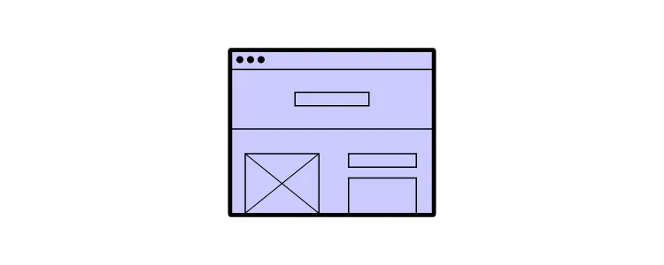
Convert your paper prototypes to digital wireframes to test basic interactivity and navigation. Digital wireframing is also helpful for designing each chat screen’s structure and the project’s information architecture.
Once you have completed the wireframing process, add your content, typography, and color to create high-fidelity mockups resembling the final aesthetic, notably:
- Background, chat bubbles, and text colors–what color scheme will you use, and how do the colors contrast for readability?
- It’s also crucial to consider how emojis, GIFS, and other graphics will render in your chat bubbles and whether the colors mask these elements.
- Conduct accessibility tests for color contrast and color blindness to ensure users with visual impairments can read chat messages.
- Test your mockups in light and dark modes to ensure the UI elements, error messages, and content remain visible.
- Remember to design mockups for desktop and mobile app notifications and consider how these will render on multiple devices and operating systems.
Prototyping & usability testing
Chat UIs require a lot of interactivity and data capture from inputs–functionality you can’t get with image-based tools like Figma or Sketch. UXPin is a code-based design tool, meaning UI elements function in prototypes as in the final product.
Designers can build a fully functioning chat UI, allowing users to send and receive messages for a realistic prototyping experience. These advanced prototypes also provide stakeholders with an accurate representation of design concepts, so they can provide meaningful, actional feedback to iterate and improve.
You must also conduct accessibility tests to ensure the prototype passes Web Content Accessibility Guidelines.
Design handoff
Prepare your prototypes, mockups, and documentation to hand off to developers. UXPin’s Spec Mode provides devs with an intuitive user interface to inspect element properties, measure distances, review documentation, read the style guide, and download assets.
Teams can also collaborate using UXPin’s Comments, tag/mention team members, and assign comments as actionable tasks they can resolve once completed.
Chat App Design with UXPin
Create a real-world chat app prototype using UXPin’s advanced prototyping features.
- Use advanced components from built-in libraries MUI or Fluent UI, including date pickers, data visualizations, dropdown menus, and more.
- Connect external apps and services using the IFTTT API.
- Create dynamic interactivity with UXPin’s States, Interactions, Variables, and Expressions.
- Add real data from Google Sheets, CSV, or JSON files.
Design your chat user interface using the world’s most sophisticated design tool. Sign up for a free trial to build your first chat prototype.


