Interactions
Take your prototype from static to motion with Interactions in UXPin. Create simple click-through mockups or fully animated prototypes.
Adding Interactions
In UXPin, you can add interactions to Elements and to the Canvas. You can add an Interaction:
- From the Topbar with the Interactions icon.
- From the Properties panel with the
+icon.
Existing interactions are marked with numbers. Invalid interactions are marked with a red highlight.
What are draft interactions?
Draft interactions are incomplete interactions that, for example, link to an element or a variable that has been deleted.
Copying Interactions
You can copy any existing interactions and paste them to one or many elements at the same time, even between Pages. To copy an interaction, right-click on the element with an existing interaction and select Copy Interaction. You can copy All Interactions or copy selected ones. To paste the copied Interactions onto any other element or a group of elements, right-click on it to open the context menu and choose Paste and then Paste Interactions.
Duplicating Interactions
Duplicating Interactions is possible from the Interactions panel to the right side. Just hover over an existing Interaction and click the Duplicate icon.
Deleting Interactions
To delete an Interaction, go to the Interactions panel and click the
"X"
icon.
Triggers
A trigger is an action a user needs to perform to start the interaction. There are two types of triggers in UXPin, Element triggers and Canvas triggers. Element triggers set off an action when a user interacts with an element, while canvas triggers set off an action when there’s a change in the canvas state.
| Element trigger | Triggers when |
Click (Tap) | User clicks or taps on a component |
Double Click (Double Tap) | User double-clicks or double taps on a component |
Right Click | User right-clicks on a component |
While Hovering | A mouse pointer enters and leaves a component |
Mouse Down (Touch Down) | When the left mouse button is pressed down over a selected element |
Mouse Up (Touch Up) | When the left mouse button is released over the selected element |
Mouse Over | A mouse pointer enters a component |
Mouse Leave | A mouse pointer leaves a component |
Swipe Left | User swipes horizontally from right to left |
Swipe Right | User swipes horizontally from left to right |
Swipe Up | User swipes vertically from bottom to top |
Swipe Down | User swipes vertically from top to bottom |
Press and Hold | User taps and hold their finger for more than one second |
Release Hold | User holds their finger for more than one second and then releases it |
Focus | A component gains focus i.e. an Input |
Focus Lost | A component loses focus i.e. an Input |
Value Change | A component is updated i.e. an Input |
Option Select | An option is selected in a multi-select list |
Elements with States will have the State Change option available.
| Canvas trigger | Triggers when |
Key Press | When specified key is pressed |
Scroll | When the prototype preview is scrolled to a defined height |
Page Load | When page is fully loaded |
Variable Change | When the variable value is updated |
Actions
An action is what happens after the interaction is triggered. It can apply to the same element as a trigger or to other elements on the canvas. In the Actions menu, you’ll see the following options:
- Go to Page – links to another Page in your prototype
- Hide – turns off the visibility of the layer
- Show – turns on the visibility of the layer
- Toggle – shows and hides a selected layer
- Set State [available for elements with States] – transitions the element into the specified State
- Set Variable – sets the Variable as the value or content of the element
- Scroll to – scrolls to a selected layer
Click More to see more options depending on the type of elements you have on your canvas:
- Open URL – links to an external Page
- Go Back – links to the previous Page in the sitemap
- API Request – allows you to make HTTP requests (GET or POST) to third party API services
- Move to/ Move by – moves the layer to/by the position specified on Y and X axes
- Opacity – changes the transparency of the layer to the given value
- Size – increases or decreases the size of the layer to the specified values
- Color – changes the fill, border or font to the specified color
- Rotate – rotates the layer to or by a specific value of degrees
- Bring to Front/ Bring to Back – moves the layer in front of all other layers or behind them
- Next State/Previous State – changes the State of an element to next or previous
- Focus – brings the form element into focus
- Enable/Disable – enables or disables the form element
- Check/Uncheck – marks the checkbox as checked or unchecked
- Set Content – sets the content of the element as the value or value of the variable
- Play – starts playing a video
- Pause – pauses a video
- Stop – stops a video
Animations
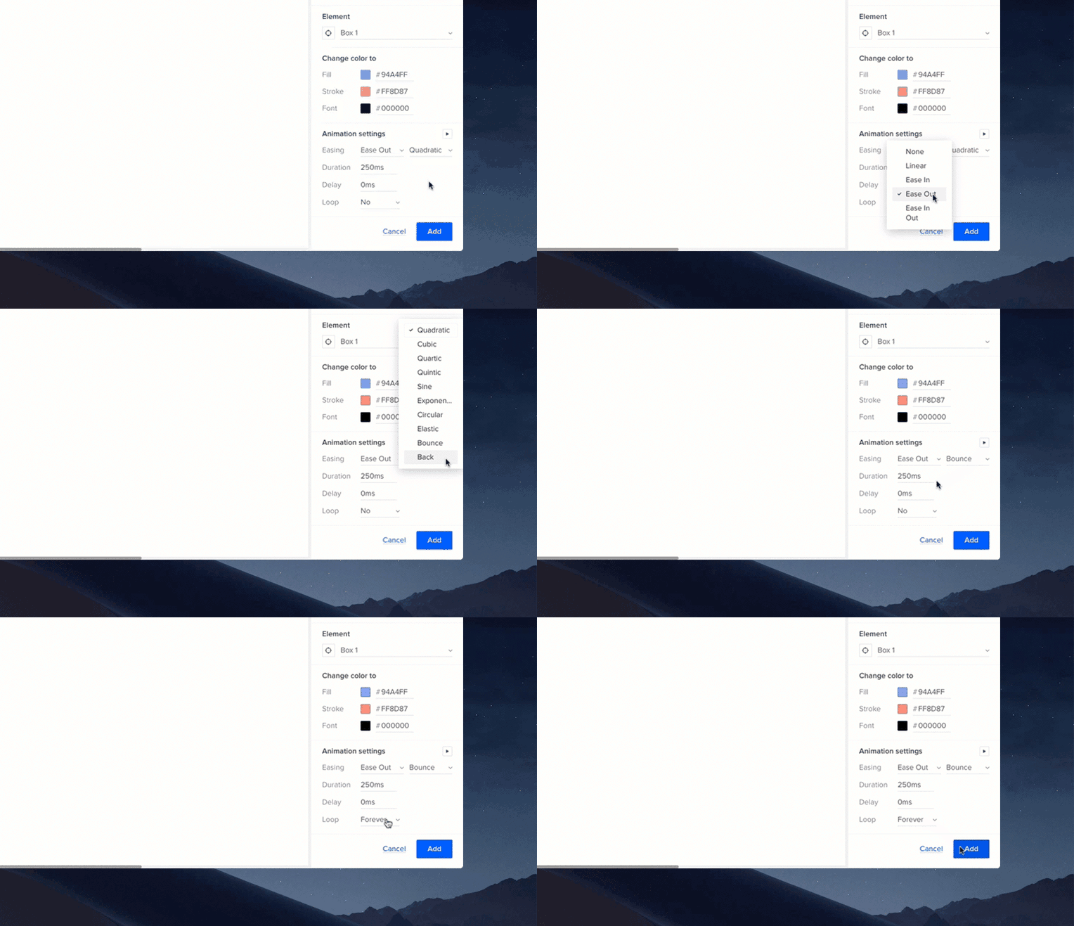
Take your simple interactions to the next level with our intuitive and quick-adjust animation editor that lets you control the way each transition from start to finish.
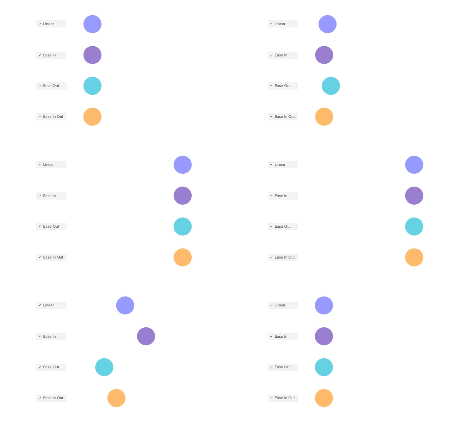
Easing lets you control how the interaction is performed over time. Choose one of the following effects:
- Linear – reflects constant speed and steady movement from point A to B;
- Ease In – starts slow and accelerates at the end;
- Ease Out – starts quickly and slows down at the end;
- Ease In Out – starts slow, gains speed and then slows down at the end.

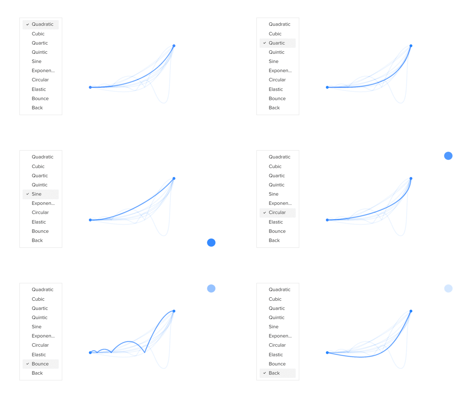
For each easing you can also define its curve to simulate the natural movement, similar to real-life objects.You can choose from the following curve types:

Tip
You can define the Amplitude and Springness for the Elastic curve.
Duration and Delay – Use the text fields to define duration and delay for an interaction.
Delays are specified in milliseconds, so 1000ms is 1 second. Small UI animations tend to have 200-300ms delays while more complex effects usually work better with 400-500ms ones. See how to use the Delay option in our Timer tutorial.
Loop – you can loop the interaction over and over again or set a limited number of loops in the Count field.

Conditional Interactions
Conditional interactions allow creating the flows of interactions to resemble the real applications closely.
They are the system of rules to determine whether a given interaction should be performed or not. All conditions have the “if-then” structure – if the conditions are met, then the action will be executed.
In UXPin the conditions are added to specific interactions. Each interaction can have multiple conditions. In such cases, you’ll be able to specify if the interaction should be triggered once any of the conditions is met or only when all of them are fulfilled. Read this how-to tutorial to learn how to validate email and password using conditions.
To add the condition, while setting the interaction click the plus icon in the Conditions section. Next, you’ll need to specify the condition settings:
- an item to be compared – value of variable, content of the element, value or an expression;
- the condition – the type of comparison;
- an item to compare with – value of another variable, content of another element, another value or expression.
If you are adding an interaction to a state of an element, you will also be able to use the “Active state” name as an item of comparison.
You can use the following conditions to compare the items:
- equals
- doesn’t equal
- is greater
- is greater or equal
- is less
- is less or equal
- contains
- doesn’t contain
- starts with
- ends with
- matches regex
- doesn’t match regex
- is empty
- is not empty
- is true
- is false
Matches regex/doesn’t match regex conditions can help you validate whether the text matches the given pattern. There are seven ready-made expressions such as URL, Email, Digits, Letters, Letters and Digits, No spaces, Strong password. Also, you can specify a custom regex. See more about regular expressions in expressions tutorial.
"if-else" Conditions
Once you add a conditional interaction, you’ll be able also to determine secondary interactions triggered when the primary conditions are not met.
In order to do so, first, create another interaction for the same element which specifies what actions should be triggered in such a case (it doesn’t need to include any conditions). Next step is to connect the interactions — hover over the secondary interaction in the Interactions section and choose Else from the drop-down visible above.
As a result, the interactions will be linked and they’ll be performed according to the specified rules. This option can be used to create complex flows such as validation forms where the button is switched to different states depending on whether all fields in the form are filled or not.
In the case of “If-else” interactions, the primary interaction should always appear above the secondary one on the list. Otherwise, the conditions won’t be evaluated.
You’ll be able also to change the order of the interactions if needed — it’s enough to grab the interaction and move it to the desired place.
Copying Interactions
There are two ways to copy interactions in UXPin.
- To duplicate an interaction already added to an element, open the Interactions section and click the Duplicate interaction icon — this way you’ll get identical interaction set for the element and you’ll be able to edit it further.
- To copy an interaction from one element into another, click on the element on the canvas and choose Copy interaction from the context menu. If there are more interactions added, you’ll be able to copy all of them or choose the specific one only.
Then, select another element and choose Paste interaction option from the context menu. You can also use the
Ctrl
"Shift"
"C"
and
Ctrl
"Shift"
"V"
shortcuts.
Additionally, you will be able to copy the interactions between different pages and prototypes. Please note that this option is possible only when both the trigger and the action apply to the same element.
Interaction indicator
Each interactive element placed on the canvas is marked with a Thunderbolt icon to help you easily identify which elements have interactions. The indicator is visible in the layers panel as well. The indicator is enabled by default — you can disable it in View Settings.