Overengineering — What is it and How Design Can Help?

Striking a balance between innovation and usability is essential. However, many organizations fall into the costly overengineering trap, adding unnecessary complexities that diverge from user needs, often overshadowing the primary product purpose. Explore the signs your product is overengineered and the steps you can take to prevent this resource-hungry problem.
Key takeaways:
- Overengineering introduces unnecessary complexities to products, distracting from user-centric design and functionality.
- Manifestations of overengineering include feature bloat, redundant processes, and overly advanced tech in simple products.
- Regular user feedback, product analytics, and competitor analysis can help identify signs of overengineering.
- Combatting overengineering involves adhering to design principles like clarity and simplicity, using iterative design processes, and leveraging tools like UXPin’s Merge.
- Unifying design and development teams through shared UI libraries and systems reduces drift and the risk of over-complicated solutions.
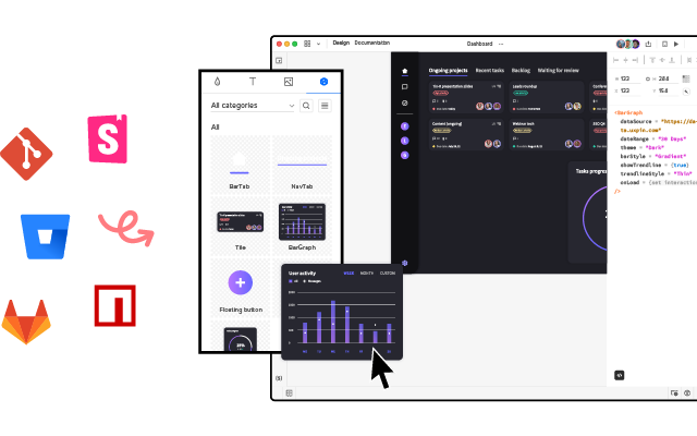
Reduce overengineering, front-end debt, and other common product development challenges. Discover UXPin Merge, the only design technology that makes it easy to prototype with coded components from Git, Storybook or npm package. Visit our Merge page for more details and how to request access.
What is Overengineering?
Overengineering occurs when designers or developers add unnecessary complexity to digital products rather than focusing on what users need. While aiming for perfection, they complicate processes, interfaces, or functionalities.
Overengineering stems from a few sources:
- Predicting distant future needs
- Misunderstanding users
- Technological over-exuberance
What are Examples of Overengineering?
Knowing what it looks like in real-world scenarios is essential to identify overengineering. Here are typical examples where the urge to do too much overshadows the user’s actual needs.
Example #1: Feature bloat in software products
Think of a word processing tool developed for basic document editing but ends up with numerous advanced features better suited for graphic design or database management. Such additions confuse average users and divert resources from improving core functionalities.
Example #2: eCommerce platforms with complex checkouts
Instead of a straightforward three-step checkout process, an online store incorporates unnecessary steps like quizzes to determine shopping preferences or overly detailed account creation protocols. These additions add friction, often leading to cart abandonment.
Example #3: Redundant user onboarding flows
A task management app has an onboarding process with multiple screens and excessive tutorials. Design teams thought they were helping users but created roadblocks and friction. Users seeking quick solutions might find this cumbersome and abandon the product.
Example #4: Physical products with overly advanced tech
Consider a toaster with Wi-Fi connectivity, voice commands, and a dozen bread settings. While it sounds cutting-edge, most users only want evenly toasted bread without navigating a tech maze each morning.
Example #5: Websites with overdone animations and interactions
Some websites prioritize aesthetics so much that they inundate users with animations, autoplay videos, and hover effects on every element. This overengineering hampers page load speed and distracts from the primary content.
Example #6: Mobile apps with unnecessary permissions
An alarm clock app requesting access to contacts, messages, and media files is a classic overengineering case. Such overreaches often raise privacy concerns and deter downloads.
How to Identify Overengineering
Step 1: Conduct regular user feedback sessions
Engage your core user base through surveys, interviews, and usability tests. Listen for indications that they’re overwhelmed, confused, or unable to pinpoint the product’s primary function.
Step 2: Analyze feature usage metrics
Product analytics are an excellent indicator of overengineering. Keep a keen eye on how users adopt new features. Employ analytics tools to monitor which features users frequently access. If significant portions of your product remain untouched, it’s a sign of overengineering or misunderstanding user needs.
For example, many companies have rushed to implement AI into their products in 2023. Imagine a photo-editing app’s analytics reveal that only 10% of users use the AI voice-controlled editing tool, whereas 90% stick to basic editing features.
While counting lines of code isn’t a direct measure of overengineering, an inflated code count for simple functionalities may be telling.
Step 3: Review software development complexity
Evaluate how intricate the development process is for each feature. A bloated or overly complex codebase can be a telltale sign of overengineering. Consider software engineering best practices to avoid ‘nice-to-haves’ and unnecessarily intricate solutions.
Step 4: Check iteration and maintenance duration
If updating or fixing small sections of your product demands excessive time, the product might be overengineered. Products should be modular and easily maintainable.
Review the need for frequent refactoring in the codebase. Regular rewrites or significant changes indicate complexities that could be due to overengineering.
Step 5: Evaluate onboarding and training time
How long does it take new users to understand your product? A steep learning curve often indicates unnecessary complexity.
Step 6: Benchmark against competitors
Compare your product’s feature set and complexity with direct competitors using a service safari to identify if your product is more complex without clear added value.
Step 7: Consult cross-functional teams
Get feedback from designers, developers, product managers, and stakeholders on whether the product’s complexity aligns with its goals.
How to Combat Overengineering in a New Product
Using design thinking–desirability, viability, and feasibility
- Desirability: Ground your designs in real user needs. Conduct in-depth user research, including interviews and surveys, to establish what users genuinely want or need. This data ensures that every design choice aligns with user requirements, effectively curbing the urge to add unnecessary UI elements. Ensure that every design aligns with business requirements to add true value and avoid unnecessary complexities.
- Viability: Ensure your design choices support overarching business needs by continually weighing the design’s potential impact on the business regarding revenue and brand perception. Adopt a disciplined approach, asking tough questions about the long-term business value of each design feature or element.
- Feasibility: Maintain close-knit collaboration with the development team to understand the product’s technical limitations and capabilities. By designing with an awareness of what’s technically feasible, you prevent creating unnecessarily complex designs, saving valuable time and resources.
Read more about desirability, viability, and feasibility in product design in our top article about it.
User-centered design approach
Ground every design decision in user insights using methods and processes that place the user front and center:
- Deep Dive into Research: Start every project with comprehensive user research to identify pain points, needs, and aspirations. Utilize tools like user personas and journey maps to visualize and prioritize this information.
- Prioritize Feedback: Make user feedback an integral part of the design process. Use tools like feedback forms, usability testing sessions, and A/B testing to collect and act on this input.
- Continuous Validation: The user-centered design approach requires ongoing validation, constantly checking your designs against user needs, ensuring alignment, and avoiding unnecessary complexity.
Iterative design and prototyping
Rapid prototyping and iterative design are your best defenses against overengineering:
- Start Simple: Always start with the most basic version of your design, focusing on core functionalities. Low-fidelity wireframes or paper sketches are effective starting points. Focus on creating an MVP first, ensuring you’re addressing core needs before adding supplementary features.
- Iterate Often: As feedback comes in, refine the design. This progressive refinement ensures you build a solid foundation rather than piling on unnecessary features.
- Embrace Failures: Recognize that not every iteration will be perfect, so you can pivot without wasting time on over-complicated solutions. Implementing an Agile methodology can further support iterative design, as it emphasizes adaptability and user feedback.
Following clear design principles
Setting clear and concise design principles aligns product teams with a common goal and purpose. Here are some typical examples of design principles to help with overengineering:
- Clarity Over Creativity: While we strive to be design innovators, clarity should always be the priority. Ensure that users can intuitively understand and navigate your designs.
- Consistency is Key: Maintain consistency in UI elements, typography, and color schemes. This uniformity reduces cognitive load and avoids the pitfall of designing overly complex interfaces.
- Simplicity Matters: Less is often more. Eliminate unnecessary elements and prioritize content and features that add genuine value to the user.
Remember the KISS (Keep It Simple Stupid) and YAGNI (You Aren’t Gonna Need It) principles–overcomplicating often leads to more problems than solutions.
Leverage design systems to align teams
Design systems help streamline and standardize design and development with a shared UI library, guidelines, documentation, and principles.
- Unified Components: Design systems provide reusable components to ensure consistency while discouraging one-off, overengineered solutions.
- Documented Guidelines: With clear guidelines on design, typography, and interaction patterns, you prevent “reinventing the wheel” and keep designs within established efficient boundaries.
- Facilitate Collaboration: A well-maintained design system eases the collaboration between designers, developers, and other stakeholders, ensuring everyone is on the same page and reducing the likelihood of overengineering. Design systems also promote extensibility, ensuring that they remain cohesive and manageable as products evolve.
UXPin’s Merge technology further streamlines design decisions by unifying teams through consistent design patterns.
How to Solve Overengineering With UXPin Merge
Product developers can use UXPin’s Merge technology to import code components into the design process, bridging the gap between design and development while creating an organization-wide single source of truth.
Unifying teams with a single UI library
Using the same UI library for design and development eliminates drift and inconsistencies, preventing teams from creating the glut that often leads to overengineering. Designers have the same constraints in UXPin as engineers developing the final product because they pull components from the same repository.
These UI elements have styling, interactions, APIs, and other properties ‘baked-in,’ so designers build solutions focused on user needs rather than designing from scratch–which often leads to drift and overengineering.
Designers and developers speak the same language
Designers often use additional platforms and workarounds to mimic code’s fidelity and functionality, leading to features or implementations that don’t align with reality.
Using code components in the design process means designers and programmers speak a unified language backed by code, translated by Merge. Designers use visual elements, and engineers use the code behind them so they’re always aligned and grounded in reality. Merge promotes transparency between writing code and design, ensuring both aspects progress in harmony.
Leveraging microservices architecture combined with UXPin Merge can further modularize functionalities, reducing chances of overcomplication.
Enhanced user testing
These interactive components allow designers to build prototypes that look and feel like the final product. End users and stakeholders can interact with Merge prototypes like they would the end product, providing design teams with meaningful, actionable feedback during the design process.
Designers can use this data to make accurate, data-driven decisions, reducing unnecessary features and the possibility of overengineering.
Stop overengineering and enhance your product development process with UXPin Merge. Visit our Merge page for more details and how to request access.


