Button States Explained – How to Design them

Buttons are pivotal in this experience, acting as road signs for user actions. This guide unravels the complex world of button states, revealing how they facilitate effective user interface design. Learn about common types of button states, design principles, and cross-platform considerations.
Key takeaways:
- Button states serve as critical visual cues that inform users of possible interactions within a digital interface.
- Consistent design across various button states enhances user experience by providing familiar, easy-to-recognize cues.
- Accessibility considerations like ARIA roles and keyboard navigation are non-negotiables when designing button states.
- Cross-platform design requires adapting button states to meet the distinct guidelines and user expectations of web, mobile, and other devices like smart TVs.
UXPin’s States lets you apply states depending on different user actions or system changes to enhance testing during the design process. Sign up for a free trial to design with States and other advanced UXPin features.
What are Button States?
A button’s state indicates the element’s current interactive condition, whether ready for a user action or in a non-responsive mode. Understanding these states ensures clear user feedback, highlighting possible actions or barriers.
For example, a hover microinteraction (changes the button style, animation, etc.) suggests a button is clickable, while a grayed-out one indicates an unavailable action. Properly utilized button states streamline user experiences, reduce confusion, and elevate interface intuitiveness.
What are the Types of Button States?

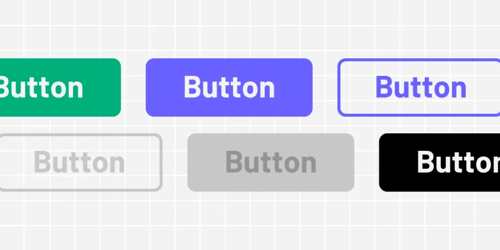
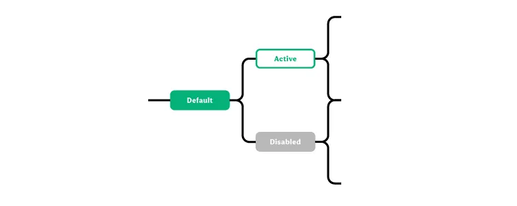
Buttons typically have four to six states (sometimes more) depending on the product and available actions. Here are seven standard states found in modern product development:
- Default state
- Hover state
- Active state
- Focus state
- Disabled state
- Loading state
- Toggle state
These states apply to all button types, including:
- Primary: The main action button, often bold and contrasting, directs users to the most important task.
- Secondary: Less prominent but still important, used for alternative actions that complement the primary task.
- Tertiary: Least emphasized, usually for low-priority tasks, often appearing as simple text or an outline.
Default state
Use case:
Default is a button’s initial or clickable state, the one users see when a page loads.
Design principles and best practices:
Opt for high-contrast colors that are compliant with accessibility standards. Make sure the label clearly communicates the button’s function.
Hover state
Use case:
The hover state is triggered when a user places a cursor over the button without clicking, indicating that the UI element is clickable.
Design principles and best practices:
Change the color or elevation slightly to indicate it’s interactable. Don’t make drastic changes; it should be subtle yet noticeable.
Active state
Use case:
This state appears when the user clicks the button, informing users the product has successfully received the action.
Design principles and best practices:
Apply a visual effect like a color fill or a shade to signify the action is processing. Make sure the effect reverses when the click is released.
Focus state
Use case:
The focus state activates when the keyboard navigation or other non-user action selects a button, usually on page load or after completing a specific task.
Design principles and best practices:
Implement a border or outline to indicate focus. Focus states are crucial for accessibility because they reduce work for screen readers and keyboard users.
Disabled state
Use case:
The disabled state indicates a button is not available for interaction. The users must usually complete another action–like a form’s required fields–before the button is clickable.
Design principles and best practices:
Gray out the button and lower its opacity. Ensure it’s visually distinct from the default state, but don’t hide it entirely–users should know it’s unavailable.
Loading state
Use case:
Loading state activates when the system processes an action triggered by a user click or tap. This state follows the active state immediately after the user releases their click or tap.
Design principles and best practices:
Use a spinner or other loading indicator within the button. Keep the user informed without requiring them to leave the button area.
Toggle state
Use case:
A toggle button turns someone on and off. You often see a toggle state in settings or interactive elements that let the user choose between two conditions, such as turning a feature on or off.
Design principles and best practices:
Clearly differentiate the two states–commonly “on” and “off”–through color, shading, or icons. The user must understand the current state immediately. Make text labels descriptive to eliminate ambiguity.
What are the Design Principles for Button States
Visual consistency
Maintain uniformity across button states to improve usability. Consistency speeds up interaction by creating familiar visual cues. For example, use the same rounded corners for default, hover, and active states.
Size & position
Position buttons where users expect them and keep sizes optimal for interaction–i.e., touch targets large enough to avoid mishits or errors on mobile devices. Predictable placement and sizing reduce navigation effort. For example, place primary action buttons on the bottom-right corner of modal windows.
Transitions
Use subtle transitions for state changes to avoid jarring shifts. Smooth transitions guide users’ eyes and improve flow. For example, implement a 200 and 500 ms fade effect when a button transitions from hover to active state.
Color & contrast
Leverage color and contrast to indicate button states effectively. High contrast aids visibility; color changes signal state shifts. For example, use a darker shade of the original color for the hover state to ensure the button remains noticeable.
Accessibility
Make button states discernible for all users, including those with impairments. ARIA roles and attributes clarify button functions, while keyboard navigation compatibility ensures universal usability. For example, add role=”button” and aria-pressed attributes to make custom buttons accessible and ensure they’re focusable for keyboard navigation.
What are Some Common Mistakes in Button State Design?
- Inconsistent visual cues: Failing to standardize button state cues across the interface disrupts the user experience.
- Indiscernible disabled state: When disabled and active buttons look too similar, users click without feedback or understanding.
- Overcomplicated transitions: Using excessive or inconsistent animations can distract and disorient users.
- Low contrast: When button states lack sufficient color contrast, users can’t distinguish between them, affecting engagement and causing potential errors.
- Ignoring Accessibility: Lack of ARIA roles or non-functional keyboard navigation alienates users who rely on assistive technologies.
How to Design Button States
Here is a step-by-step tutorial for designing button states. We’re using a FinTech app to provide context and examples.
- Step 1 – Identify User Actions: List the actions users will take in your FinTech app. For example, users need to “Transfer Money,” “View Account,” or “Invest.”
- Step 2 – Sketch Initial Designs: Use wireframes to sketch your buttons’ basic shapes, sizes, and placements.
- Step 3 – Determine Button States: Decide which states each button will have–default, hover, active, focus, disabled, loading, and possibly toggle for feature toggles. For example, the “Transfer Money” button will need a default, hover, active, and disabled state.
- Step 4 – Pick Colors and Contrast: Use high-contrast colors that align with your FinTech app’s brand guidelines. Use a Contrast Checker and Color Blindness Simulator to test accessibility.
- Step 5 – Design Transitions: Choose subtle animations for transitioning between states and screens.
- Step 6 – Test Size and Position: Ensure buttons are large enough for mobile users and positioned where they are most intuitive.
- Step 7 – Implement ARIA and Keyboard Navigation: Make the button states accessible. Use ARIA roles and ensure keyboard navigation works seamlessly.
- Step 8 – Testing: Conduct usability testing to catch any mistakes or areas for improvement. Share designs with stakeholders for feedback on business objectives.
- Step 9 – Iterate: Based on testing feedback, make necessary adjustments. Test redesigns to ensure they solve user and stakeholder issues.
- Step 10 – Design handoff: Collaborate with engineering teams to convert designs to functional code. Ensure devs implement non-visual elements like ARIA attributes for accessibility.
How to Design Button States for Cross-Platform Applications
Platform differences between mobile, web, and other interfaces like smart TVs require distinct design strategies. Even within the mobile universe, iOS and Android have different rules and principles for UI design and interactivity. Here are some things to consider when designing button states for cross-platform applications.
Mobile vs. web design
Mobile: Buttons must be large enough for touch but not so big that they overwhelm the interface. Mobile environments often use tap states similar to hover states on web interfaces.
Web: You can employ hover states and tooltips with more space and a cursor. These don’t translate well on mobile, so make sure your web designs are mobile-friendly.
iOS vs. Android
iOS: Apple’s Human Interface Guidelines specify rounded corners and a flat design. States are often less flashy, focusing on simple color changes or subtle shading.
Android: Google’s Material Design allows for more expressive animations and elevations. Android buttons lift when tapped, adding depth to the state transition.
Other platforms and devices
Smart TVs, Game Consoles: These platforms often rely on remote or controller-based navigation. Button states must be prominent and highly visible, and focus states are more of a priority than web and mobile design.
Interactive Button State Design With UXPin
UXPin is a code-based design tool with more features and functionality to create fully interactive prototypes. UXPin’s States lets you create simple component states and complex UI patterns like dropdown menus, tab menus, navigational drawers, and more.
Designers can define properties and interactivity for each state, with triggers for web and mobile applications–i.e., click and hover for desktop or tap and swipe for mobile.
UXPin’s code-based interactivity provides users with a realistic prototyping experience, indistinguishable from the final product, giving designers meaningful, actionable feedback to iterate and solve more challenges during the design process.
Design button states faster and achieve accurate results during testing with UXPin. Sign up for a free trial to explore States and other advanced UXPin features.


