Prototyping in Figma vs UXPin – Possibilities & Limitations

Figma prototypes are great for visualization of what the end-product can look like, explaining design decisions, and planning user flow. They fall short when it comes to testing your prototype. This is where UXPin prototypes shine. UXPin helps designers create interactive prototypes that bring quality test results. Let’s analyze both tools.
Key takeaways:
- Figma offers real-time collaboration in a vector-based design environment, while UXPin provides advanced interactive prototyping through a code-based approach.
- Due to advanced features like Merge, complex interfaces can be built significantly faster in UXPin than Figma.
- A comparison test revealed that prototyping in UXPin was 8X quicker and more interactive than in Figma.
- While Figma excels at creating static UI mockups, low-fidelity prototypes, and collaborative design, it lacks interactive prototyping capabilities.
UXPin’s Merge technology allows design teams to build code-based prototypes streamlining the design-to-development transition, offering cost and time savings.
Bridge the gap between design and development and build advanced interactive prototypes using UXPin’s Merge technology. Visit our Merge page to learn more and how to request access.
What is Figma?
Figma is a vector-based design tool that enables real-time collaboration. Designers can use Figma to create various design assets, from wireframes to mockups to prototypes and information architecture.
Figma was founded in 2016 as a browser-based vector graphics editing tool, making it an interesting alternative to Adobe products which dominated the market at that time. Many UX/UI design teams fell in love with the simplicity of Figma and started to use the tool in their job – designing user interfaces.
Figma prototypes are great for explaining to other teams what design should look like. The tool is amazing at making creative prototypes, design explorations, and powerful drawings. Figma prototypes lack advanced interactivity that stays within dev’s environment constraints. It’s what UXPin is great at.
What is UXPin?
UXPin is a code-based full-stack design tool for cross-functional collaboration. UXPin’s biggest benefit is its interactive prototyping capabilities. Designers can build fully functional prototypes that look and feel like the final product. The platform also makes creating wireframes, mockups, map user flows, and information architecture effortless with built-in libraries and forms.
UXPin prototypes can behave like a real product, because designers can put real interactions in their prototypes, store user input while testing, and use real data.
The design tool incorporates all the benefits of an easy-to-use interface with powerful code-backed features allowing designers to:
- Build robust interactive prototypes.
- Get high-quality, meaningful feedback from users and stakeholders.
- Streamline design handoffs.
What is the Difference Between Prototyping in Figma vs UXPin?
While Figma offers a reliable solution for prototyping with its collaborative capabilities and component-based approach, UXPin goes further with advanced interactions and a seamless transition from design to development with its Merge technology.
“With UXPin Merge, you can build complex interfaces in half an hour to one hour. In Figma, those interactions would take a week.” Larry Page, UX Lead Designer at Optum.
Figma falls into the “legacy design tool” category. While it’s easy to use, and designers can achieve beautiful Figma designs, the platform hasn’t evolved to meet modern UX design standards.
Here is a quick comparison of UXPin and Figma’s prototyping capabilities.
Figma:
- Basic interactions and transitions: Figma allows designers to add basic clickable transitions, making the mockups more engaging.
- Component creation and design systems: Designers can create shareable, reusable components to maintain UI consistency.
- Collaborative design capabilities: Multiple designers can simultaneously work on the same design, streamlining the design process and promoting collective creativity.
UXPin:
- Advanced interactive prototyping: UXPin goes a step further with its sophisticated prototyping abilities. Features such as States, Interactions, Variables, and Expressions facilitate a more realistic prototype closer to the final product.
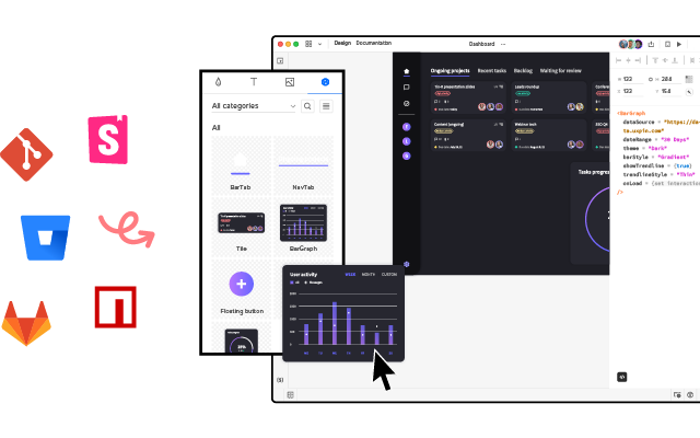
- Code-to-design with Merge: Designers can import React components into the design process, allowing them to build prototypes indistinguishable from the final product. Merge helps bridge the gap between design and development, aligning both processes for seamless product delivery.
- Real-time collaboration and user feedback: UXPin’s Comments facilitate cross-functional collaboration with team members and stakeholders. Yet, its edge lies in capturing user feedback directly on the prototype, enabling iterative design refinements based on tangible user insights and stakeholder feedback.
How Figma and UXPin Compare–a Real-World Case Study
Senior UX Designer, Anthony Hand, wrote a Medium article comparing UXPin and Figma’s prototyping capabilities. The team created a custom Microsoft Fluent web library, including relevant brand colors and third-party icons.
Anthony used a Fluent UI kit in Figma and imported a React UI library GitHub repository into UXPin using Merge technology. The React components included styling and interactive properties defined in the repo and necessary controls and APIs.
Conversely, the Figma UI kit was a static version of the Fluent Design System, requiring designers to set up relevant variants and interactions–albeit with significantly less fidelity and functionality than the React components in UXPin.
The experiment
Anthony created the same single-page reporting prototype on both platforms to compare UXPin and Figma’s prototyping efficiency. It took him an hour to design the page in Figma and just eight minutes in UXPin.
“The UXPin prototype had live dropdowns, calendar buttons, a sortable data table, and even an interactive Highcharts pie chart!” Anthony Hand, Senior UX Designer.
The prototype Anthony created with UXPin was better quality, had fewer errors, and featured interactive elements thanks to its use of live Microsoft Fluent controls. Conversely, the Figma prototype lacked these interactive qualities, relying on rasterized images that reduce real-time interaction–even though it took more than 8X as long to create.
Anthony’s conclusion
While Figma serves as a web-based evolution of familiar graphic design platforms and is an advancement over older tools, it still has limitations. UXPin stands out with its focus on “interactive prototypes” through a code-based design approach, allowing designers to create designs that feature live code elements, enhancing the interactivity and realism of the prototypes. Additionally, UXPin offers capabilities for complex interactions on a single page with minimal learning requirements.
“I liked Figma a lot. It’s a huge improvement over my previous go-to design tool, Balsamiq. But now that I’ve learned how to leverage the powerful scripting capabilities of UXPin and design interactive UIs with the same live HTML UI controls that my engineering colleagues will use in the finished product, there’s no way I could go back.” Anthony Hand, Senior UX Designer.
Is Figma Good for Prototyping?
Figma is undoubtedly a fantastic UI design tool but lacks the features necessary to create realistic interactive prototypes. Designers can still do some prototyping in Figma. Here are some examples of where the platform is most useful during the design process:
- Static UI mockups: Figma’s intuitive user interface and features make designing mockups effortless.
- Low-fidelity prototypes: Figma is great for low-fidelity wireframe prototypes since these only require basic transitions between screens.
- Information architecture: Designers can organize screens on a single artboard to map and visualize a product’s architecture and user flows.
- Collaborative design: Figma makes real-time collaboration easy, allowing teams to leave comments, run design critiques, access version history, and more.
What are Figma prototyping limitations?
Here’s where you might want to consider UXPin instead:
- Interactive prototyping: Figma offers simple click/tap interactions. Capturing user data and creating complex components like dropdown menus, carousels, accordions, and date pickers aren’t possible in Figma–limiting what designers can test.
- Live data and APIs: Unlike UXPin, you can’t import live data with Figma. These complex integrations require engineering input, increasing time and resources, making them unfeasible for most projects.
- Code-to-design: Figma works on a design-to-code approach, meaning developers must convert designs into code–a time-consuming and complex task. With the help of Merge, UXPin’s code-to-design workflow means designers can build code-based prototypes with the same building blocks developers use, significantly reducing development time while creating a seamless product development workflow.
Why is it Better to Prototype in UXPin?
The common theme throughout this article is interactivity. Modern digital products require designers to test ideas using interactive prototypes. Why?
- Development is time-consuming and expensive. Solving issues during the design process can save organizations countless time and resources, reducing wasteful expenditure.
- User experience is crucial for product adoption, engagement, and retention. Interactive prototyping allows designers to solve usability issues during the design process and enhance the product’s user experience.
When designers use image-based tools for prototyping and user testing, they miss usability issues and business opportunities during the design process. They must add these changes to the product’s UX and technical backlog, increasing debt and avoidable costs.
How interactive prototyping reduces UX debt
Merge reduces wasteful and avoidable UX and technical debt with better testing and smoother design handoffs. The design team can import interactive components from a design system repository for prototyping. This fully interactive component library increases prototyping scope, allowing designers to build exact replicas of the final product–impossible to do with image-based tools like Figma.
Users and stakeholders can interact with Merge prototypes like they would the final product, giving design teams accurate, meaningful insights to iterate and improve.
Design handoffs require less documentation and explanation because designers and engineers use exactly the same components. Devs can import the same UI library from the same repository, apply JSX changes from UXPin, and deliver the end product.
“UXPin Merge reduced our engineering time by around 50%. Imagine how much money that saves across an enterprise-level organization with dozens of designers and hundreds of engineers.” Larry Page, UX Lead Designer.
Faster prototyping and iterations
Merge effectively creates a no-code, drag-and-drop prototyping environment for designers. As we learned from Anthony’s case study, switching to Merge allowed him to build a prototype 8X faster in UXPin than Figma using the same UI library.
Making changes to components and prototypes is quick and efficient using UXPin’s Properties Panel. Still, designers can increase efficiency by creating multiple variations and states for a single UI element and saving these in UXPin’s Patterns. Instead of making adjustments in the Properties Panel, designers simply swap components to get instant feedback during testing.
“It’s been so helpful for us to have these high-fidelity prototypes built with UXPin. We build high-fidelity prototypes much quicker and get immediate feedback after the session. If there’s something we can fix immediately, we make that change before the next participant and get feedback much faster than before.” Erica Rider, Product, UX, and DesignOps thought leader.
Take your prototyping to the next level with interactive components using UXPin’s Merge technology. Visit our Merge page for more details and how to request access.


