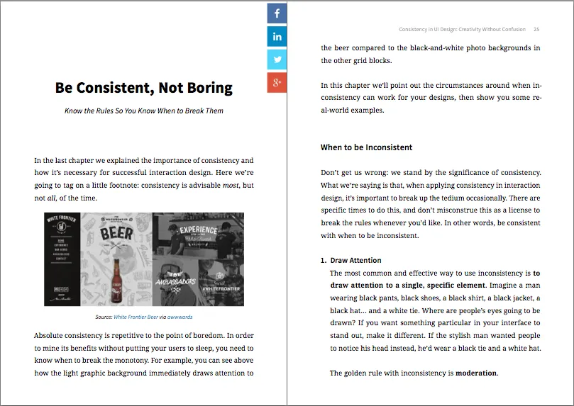
There’s a fine line between consistency and uniformity in web design. If your designs aren’t consistent, then users will be confused. If your designs are too consistent, then users will be bored.
Take a look inside this free e-book to see how to strike the right balance.
What’s in the free e-book?
Consistency in UI Design: Creativity Without Confusion only includes practical advice accompanied with real-world examples.
As with all our e-books, we’ve trimmed the fat so the book is as actionable as possible.
The free e-book features:
- Practical exploration of when to be consistent and when to be inconsistent in UI design
- Examples from Adobe, Reddit, Amazon, Jawbone, Xfinity, and others teach you the do’s and don’ts of consistency
- See the criteria for ensuring your design is consistent across all pages while feeling familiar to users


