No matter what process or documentation you use, one guideline always remains relevant: design for the user.

Photo Credit: Stefano Montagner. Creative Commons.
Understanding — even empathizing — with the user is the key to designing a product that they will choose, even in a flooded market. But it’s no coincidence that one of the most important feats of design is also one of the most difficult. That’s what the documents in this chapter come in — to help you understand the people you’re designing for.
1. User Personas
User personas are perhaps the most important document you’ll create for analyzing users. They are the foundation for the rest of user documentation, which expands on personas for deeper insights. Under the right circumstances you can get away with skipping some of the other user documents, but skipping personas is not at all recommended.
Purpose
Personas are the most important person in the room when making design decisions. The psychology, behaviors, and demographics of your target users feed into these fictional identities.
Personas make the data more comprehensible by giving it a name and a face, instead of cold numbers and words without context. Designers use personas at every stage of the process and every important design question. Simply asking yourself “which options would this persona enjoy most” allows you to hone in on creating a product that will appeal most to a specific type of person.
This may seem lofty to designers who never used such “imaginary friends” before, but it’s been proven that personas directly increase the success of the final product.
Best Practices
Personas can be as large or as small as you need them to be. The important concern is not how much information they contain, but that every piece of information is relevant and supported by product usage data.
Here’s the process we follow at UXPin to create more data-driven personas:
- Examine usage data in our app, segmenting users based on overall engagement. E.g., people who started a trial but didn’t buy, people who started a trial and bought, etc. Once we’ve defined the segments, we look at how they behave in the app based on events created in KISSMetrics.
- To add a qualitative dimension, we interview ~30 users total from all segments to try to understand the “why” behind the data.
- Based on quantitative data and interviews, we can start plotting out patterns that eventually form our user personas.
While the type of data on display can change, typically the best personas all have the following:
- Photo & Name — Even if just a stock image, a photo helps to think of your persona as a real person. Avoid celebrity photos and use a real name instead of “Pete the Power User”.
- Demographics — A good reference guide for the basic groups you’re targeting.
- Personality — While a detailed narrative gives the best description, at the very least include a few relevant traits like “spontaneous” or “lazy.”
- Technological Expertise — This shows the level of complexity to make the system, or maybe how much explanation is needed for certain functions.
- Platforms — On which platforms your user will likely use your product.
- Goals (Motivations) — These can be divided into what your user hopes to accomplish with your product, as well as their life goals for understanding their character.
- Personal Quotes/Mottos — A personal quote is a shortcut to establishing the persona’s character.
While detail is always good, don’t get carried away. Your persona should only be as thorough as it is useful, and there will come a point where your time is better spent designing.
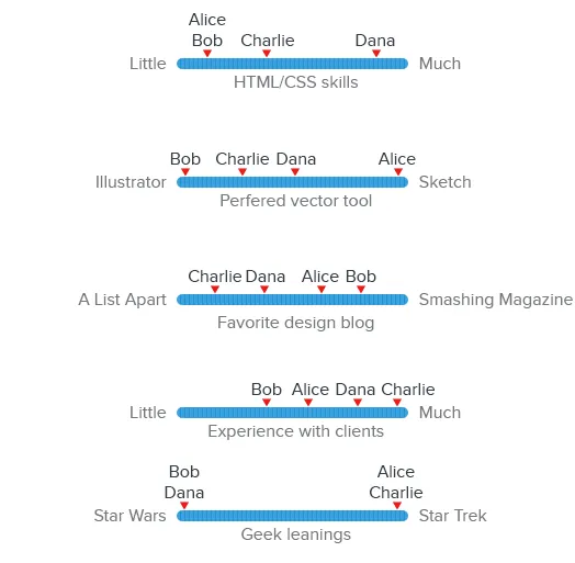
Spectrum scales are the key to boiling down dozens of people into actionable patterns. Plot out 5-10 scales for different user characteristics based on people you’ve researched and interviewed. As patterns emerge across the different characteristics, you can see where multiple people can be represented by a single persona.

The persona itself should be readily available to allow the team to check it (or share it) easily when the need arises. Share them with the team, print them out, and refer to them often.
2. User Stories
Once you have your personas set up, it’s time to use them. A good first step is creating a user story. These are simple sentences or small paragraphs that elaborate on the user’s motivations and goals.
User stories typically follow this format:
As a [type of user], I want [a feature] so that I can [complete a goal].
For example, user stories for some UXPin customers would look like this:
As a marketer, I want to quickly offer feedback on designs so that I can return to my daily non-design work.
As a UX designer, I want to consolidate feedback from all teams so that I don’t waste time digging through email chains.
Purpose
User stories allow designers to hone in on the user goals and motivations, which can otherwise get lost with all the other information. As the most important element to consider during a design, your users’ goals should be clearly defined. User stories relate them in a digestible snippet that’s easier to comprehend than dry requirements, sometimes written from a company-centric perspective.
Tom Brinton also points out that user stories prevent “feature creep” — an unending cycle of adding extraneous features — by zeroing in on only the essentials.
Best Practices
User stories are quick and easy, but also insightful, all of which make them a great collaboration tool. Trying opening up participation to the entire team — perhaps in a Google spreadsheet like this — so that you document a broad range of company goals.
Don’t forget that the value of user stories is their simplicity: they should be succinct and meaningful, and written in plain English. This also aids in collaboration across departments, since not everyone will know each other’s jargon.
At the same time, be specific. Dive into your user research (especially interviews) to fill in the “So that…” section as accurately as possible. The hardest part about user stories isn’t deciding the core tasks, but then understanding why.
3. User Scenarios
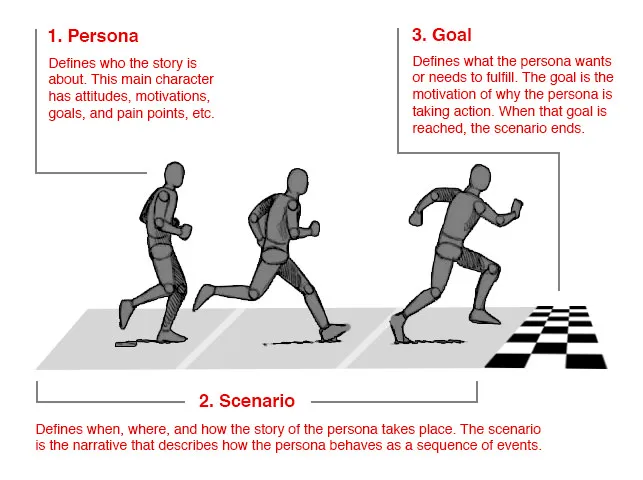
Now you have your personas and their goal. A user scenario explains the step-by-step process for getting there, including which pages they go to, where they click, and how long each stage takes.

Photo Credit: Shlomo Goltz. “A Close Look at Personas: What They Are and How They Work (Part 1).” (with permission from Smashing Magazine)
Purpose
User scenarios create the context behind the user stories.
What are the specific situations in which that user story might occur? You really start to explore the user’s emotions during the process, helping to not just understand the user, but to empathize with them.
In the above example, note the level of detail we add so that we understand the user’s logical and emotional needs.
Best Practices
The format of the user scenario depends your needs: it could be a bulleted list with statistics listing the technical details (“5 seconds on the home page until he notices the log in link in the corner”) or it could delve into emotional details, reading more like a narrative than a UX document (“eager to get started, his eyes frantically scan the home page until finding the log in link”).
Whatever style you choose, keep these factors in mind when determining how your users act:
- Behavior – Are there any existing user habits you must account for?
- Motivation – How important is accomplishing their goal, and how will that impact their decision-making?
- Environment – Where are they using your product? Work, home, and on the go all have different conditions and distractions. Moreover, what device are they using?
- External Factors – These are miscellaneous factors that impact their usage, from their internet speed to time constraints.
It’s quite normal to create multiple scenarios for each user story.If you already have a Google spreadsheet for the user stories, it’s as simple as adding more columns.
As with the other documentation, details are good, but don’t overdo it. There’s no need to plot out the process for every task — handling the most common ones well will give you a good enough understanding to plan for the less common ones.
For more advice on user scenarios, including more examples, read this article by Sabina Idler, a UX researcher and consultant.
4. Customer Journey Maps
Personas, user stories, and user scenarios will give you enough understanding of your user within the context of your product, but you must create a customer journey map if you want to understand the entire brand experience.
Customer journey maps are the ultimate user document. They don’t limit themselves to the beginning and end of a goal — they span the periods before and after the experience, so you account for all the lasting effects.
Purpose
A good product of any type anticipates user wants before even the user knows, creating a satisfaction that can best be described as “magical” — that delightful feeling when a product you’re using just intuitively “clicks.” Customer journey maps help to isolate the opportunities in which you can design for such moments.
For a real world example, Joyce Hostyn points us towards Domino’s (slides 96-97). The pizza makers realized that, in the time surrounding their interaction with the product — not just interacting with the product itself — users experienced anxiety between the order and the delivery. They then implemented the Domino Tracker, which allows users to track the status of their delivery before it arrives.
These emotional insights can make the difference between a product that’s used, and one that’s loved.
Rian van der Mere praises customer journey maps for their aid in prioritization and keeping designers focused on content. As he points out, this document can be referenced with each new design idea to see if on track with the ultimate company goals, or something unnecessary.
Best Practices
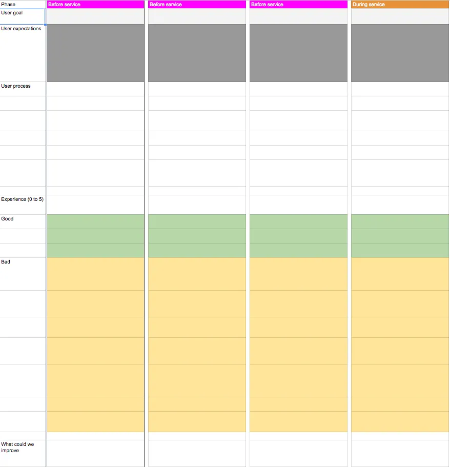
At UXPin, we use the following customer journey map template:

Photo Credit: UXPin
The basic setup breaks the entire process into the key steps, including the time before and after the interaction. For each step, the customer journey map addresses the users’ states of mind in these areas:
- Goal — What do they hope to accomplish at this step?
- Expectations – How do they think this step will go? Outside influences and competitors’ product have big impact on this.
- Process –- How do they hope to accomplish their goal? Notice the difference between their chosen process and the best possible process.
- Rating of Experience – If the user had to rate this stage, what would they say?
- The Good – What does the user like about this stage?
- The Bad – What doesn’t the user like about this stage?
- Improvements – Taking all other information into account, what can you change to improve your user’s experience?
Adam Richardson suggests also addressing questions and barriers. Examining a design from a different perspective may reveal that problematic aspects of a design, such as areas of confusion and obstacles interfering with the user achieving their goals.
This article by Megan Grocki for UX Mastery further dissects the components of customer journey maps and provides more details into the theory and best practices behind them.
Takeaway
As we’ve mentioned before, the design process is rarely linear. In an ideal world without deadlines or other restraints, you could build all these documents at their leisure before even considering the design. But that’s not always the case, and sometimes these documents can come “out of order.”
We highly recommend creating and applying user documents early on, while you’re still defining the product. However, they can still be revised, improved, or replaced later on in the process, especially if new data comes in. And if you’re testing early and often like we suggest, this will be likely.
If you enjoyed this article, check out our free e-book UX Design Process Best Practices, written with our own years of experience planning, designing and testing UXPin.


