Re-Imagining Iress Design Tools – Iress Case Study
This article was written by Nick Elliott who works as a Design System Product Owner and Regional Head of Product Design at Iress.
As with many design systems teams, at Iress, we want our design system (which we call the IDS) to be more than simply a set of components. We want our design system to be a framework that our colleagues love to use and something that helps anyone at Iress create great experiences for the people using our product and services.
As a technology company providing software to the financial services industry, the design team at Iress has always looked to remove inefficiencies that can form in the handover between design and engineering, as well as how we can continue empowering our teams to create awesome experiences together.
Over the last few years, design tools have adapted and our design team has been on a journey to review our own design tools – one of which is UXPin Merge.
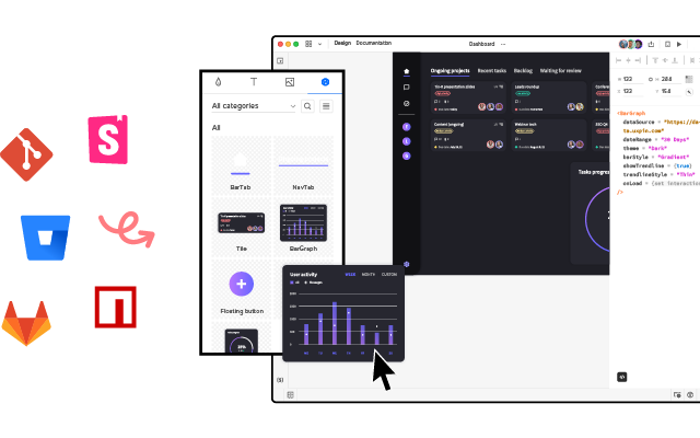
Build prototypes using your dev’s design library components. Bring React, npm or Storybook components to UXPin and create prototypes that look and behave like the end product. Discover UXPin Merge.
Days gone by
Let me spin a story – one that may resonate with you…
Danielle is a designer. Through a discovery session, she gets to understand a user’s problem. This may be based on previous research, data, direct feedback or a combination of all of these. There may be a team ideation session. But at the end of the day, as the designer, Danielle is asked to make a prototype. She uses a design tool that creates a load of linked, clickable images. She may go and test this to confirm that she is solving the problem in the right way. She then gets agreement with stakeholders that this is what they are going to build.
Daaruk, an engineer, then takes this prototype and recreates it in his software development tool of choice. Daaruk quickly realises that what Danielle has designed is really hard to build, and has some issues. There is a bit of to and froing and compromises are made. Then Daaruk finishes the work and presents it back in a UX review. Danielle isn’t happy – she doesn’t really like what she’s seeing – the typography and vertical rhythm are off, the tab order isn’t right causing accessibility issues and some of Danielle’s expectations of how the screen would work didn’t come through from the prototype. Daaruk makes some changes, but is also unhappy as he has to spend time unpicking a lot of work to make what looks like minor tweaks.
And now we’ve run out of time. We promised this would be delivered by a date and we have so many other projects in the backlog. We ship the feature with compromises. And then when it ships, we get a load of feedback from our users. The experience hasn’t quite hit the mark and there are loads of usability issues. This then comes back to Danielle and Daaruk again, stopping them and the rest of the team from working on other projects that will make further impact.
Does this sound familiar? If so, keep reading.
The inefficiencies of the design to delivery handover
So the above is hugely inefficient. Why?
- Danielle is prototyping on her own, rather than as a part of a team. She has to present this back and spend time with other members of the team until they are all happy.
- Danielle is testing something unrealistic with end users – because users can’t interact with the image-based prototype as they would a normal application, usability issues are found out way too late.
- Danielle is creating something that is thrown away. Daaruk has to restart from scratch. ‘Design drift’ occurs.
- There are lots of reviews between Danielle and Daaruk that create rework.
- Danielle and Daaruk are working on different tools that are not connected – there is no centralised way to refer to the same typography, spacing, components and patterns.
- The Support and Product Teams need to spend time understanding the issues that users are finding, once the new feature is released.
- Danielle and Daaruk have to do rework to fix the experience and usability issues that have been found.
- In extreme cases, users are so put off by the experience, they lose trust and it takes a lot of the client-facing team’s time to convince them that we’ve fixed the issues and that it’s worth using again.
Design system maturity scale
Earlier this year TJ Harrop, Design System Product Manager at the NSW Government introduced Global DesignOps conference attendees to a design system maturity scale.
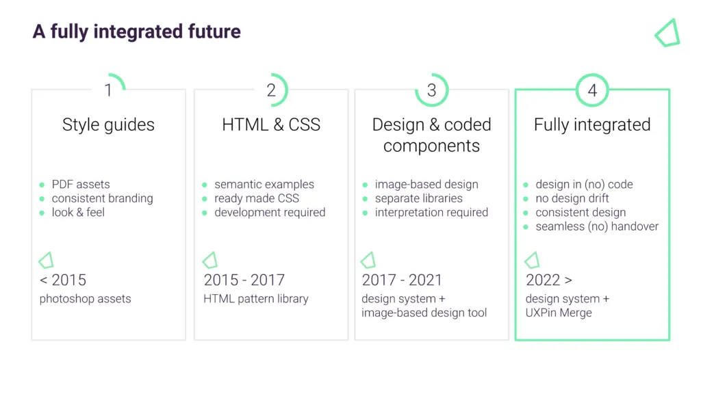
I’m paraphrasing TJ’s concept, but he talked about 4 levels of design system maturity (TJ’s concept talked about ‘Full Stack UX’, which I won’t go into here)…
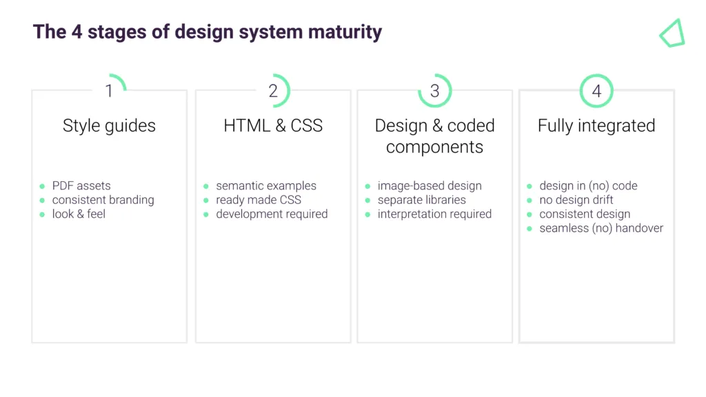
- 1st stage: Design system assets are created in tools such as Photoshop or Illustrator.
- 2nd stage: We have CSS & HTML style guides – used for guidance only.
- 3rd stage: We have two sets of components that are meant to look alike – one for designers and one for engineers.
- 4th stage: We have a single source of truth where designers and engineers are using the same design system components.
In terms of our journey at Iress, we are currently at stage 3.
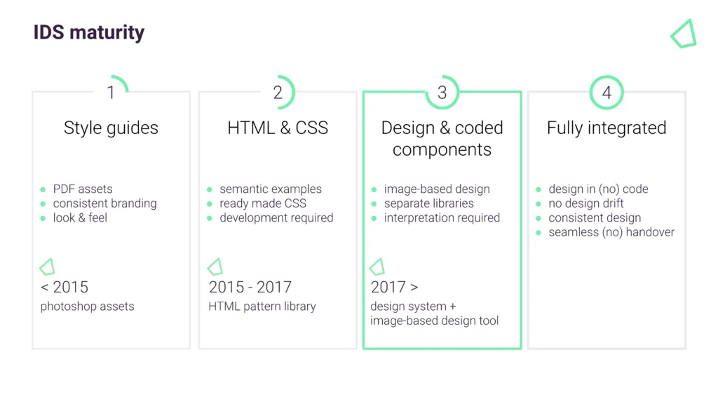
But stage 3 can still be hugely inefficient because two sets of people maintain two separate sets of components – one in the design tool, and one the engineers use in production. In addition, every time there is an IDS update, we have to mimic this in the design tool. It can get out of sync really quickly.
Also, because the design tool components aren’t as sophisticated or don’t have the same constraints as the ones used by engineering, it can cause inconsistency – even within the same design team.
And finally, we have to theme our design system. Being able to prototype and test the same components with a client’s brand, means another set of components that again can get out of sync quickly.
Our goal at Iress is to get to the final stage of design system maturity.
How Do I Mature a Design System?
Over the last 12 months, we’ve been reviewing the design tools on the market. While some design tools are great for design agencies working on lots of small projects and many brands, they are not effective for designing at scale with an enterprise design system. And this is why we are excited by Merge.
We are at the beginning of our journey, but it is our hope that:
- With Merge integrating directly with the code repository, designers and engineers will be using the exact same components. Maintained centrally, with one set of components, this will free up our designers’ time.
- And because we are using the same components and settings (props), we hope our designers and engineers will be better aligned. Designers will better understand the constraints of using the design system. If there is reasonable evidence to do something different or bespoke, this can be done within the team, or escalated to the IDS Team to discuss an enhancement.
- It will help us create more interactive and realistic prototypes. People can tab around, or see the same interactions – hover styles, animations, etc – as they would expect in a real app. We can do more insightful user testing and discover usability issues much earlier in the process.
- The markup required to render the prototype can be taken directly from Merge and handed over to the engineer, who can place it in their software development tool of choice. This should hopefully speed up development. The engineer no longer needs to start from scratch and already knows what components and settings to use. It will help us avoid the ‘design drift’ we so often see. Things like spacing and typography should all be aligned, as it is all driven from one place.
- It will give us the opportunity to experiment with theme/brand switchers, as well as test responsive prototypes mimicking different devices.
- It will give non-designers access to a tool, whereby they can also experiment and have exposure to the same design considerations.
- It will allow more collaboration, allowing designers to be facilitators of the design process, not the owners of design.
Final thoughts
In conclusion, we are excited about Merge. It’s not to say that there won’t be any bumps on the way – it’s a different way of working. Some people will love it, others maybe less so. But if Merge can help us scale, empowering our many teams at Iress to use our design system consistently and efficiently, then it’s a massive step forward from where we are today.
Streamline your design and development processes. Bring your own components to UXPin via npm, Storybook or Git integrations. Leverage a single source of truth and build prototypes that developers can quickly translate into code. Discover UXPin Merge.
