Perhaps the most important thing to keep in mind when designing a mobile application is to make sure it is both useful and intuitive. If the app is not useful, it has no additional value and no one has any reason to use it. If it is useful yet entails a steep learning curve, people won’t bother learning how to use it. Good UI design addresses both of these design problems, and as discussed in Successful Mobile Applications: Using UI Design Patterns, the formalized best practices for solving common design problems are known as design patterns. Understanding and recognizing today’s newest and most trending design patterns can give you a huge leg-up in the industry of mobile application design, so that your next app will be fresh and competitive.
This post focuses on design patterns used for navigating a mobile application. Regardless of what kind of application you are designing, you will need users to navigate the different features of the app effectively and efficiently – how users navigate through your app may determine whether they will like it enough to keep using it.
1. Walkthroughs & Coach Marks
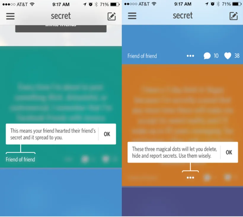
Usefulness is key to a successful app. However, sometimes this means a rather complicated application with many different types of tools and content. A good way to address this problem is through an initial walkthrough or tutorial to demonstrate how each function works. Secret and Youtube highlight important sections of the user interface with coach marks that explain what they do, while Carousel and Duolingo show a slideshow walking the users through the typical user experience. This design pattern can also be utilized to collect additional information from the user, allowing for an easier initial registration/sign-up experience and more intuitive integration into the app.
If the different features of your app are not immediately obvious to the user, walkthroughs and coach marks are great design patterns to simplify user experience and app complexity.
2. Content-Based Navigation
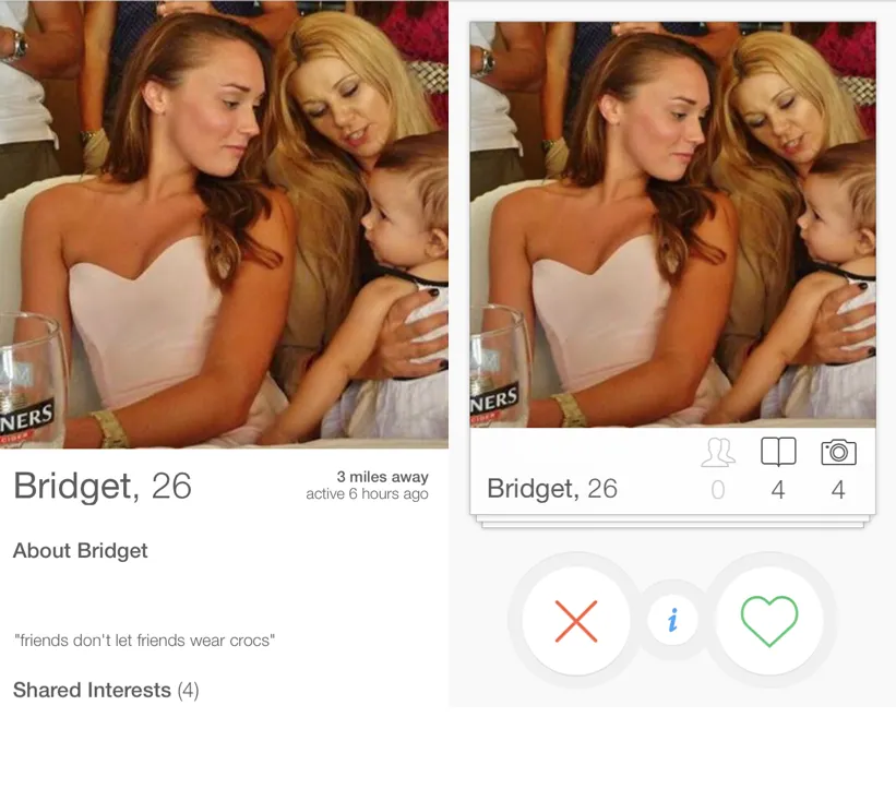

No matter what kind of content you want to include in the design of your app, you always want to make the user experience and flow of that content as fluid as possible. Content-based navigation is a design pattern used for incorporating seamless transitions between overview and detailed states. Tinder provides a great example of this pattern: you can toggle between two states on a user profile – the main overview state that is essentially a picture filling up most of the screen, and a detailed view that makes the picture only slightly smaller and includes some factual information. You can transition between either state by simply clicking the screen in either view, as well as swipe through pictures in whichever state you choose.
3. Sliders

In Uber, you can see that there are four types of ride services, and instead of requiring four separate screens to deliver the necessary information, Uber uses the slider design pattern to allow for easy toggling between each ride service. This generates a seamless transition between options with the swipe of a finger, making the display of these features very intuitive for the user.
4. Popovers
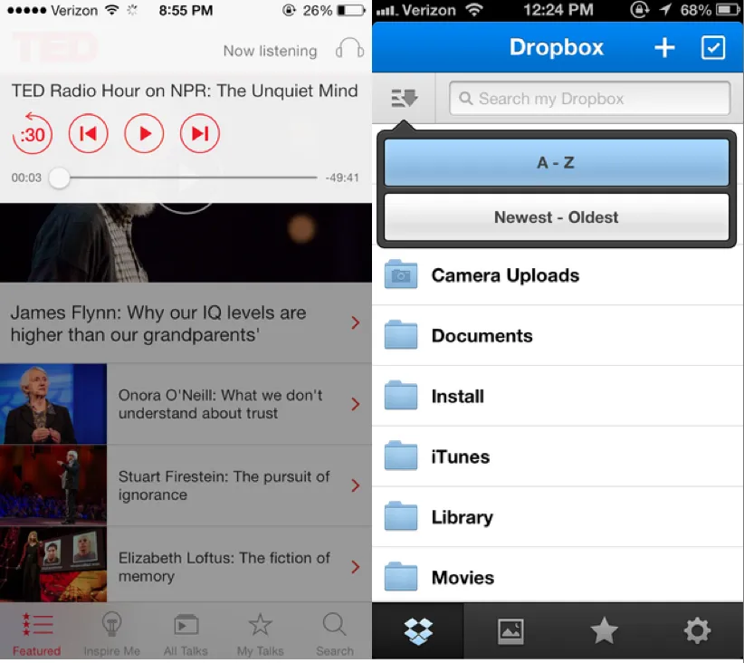
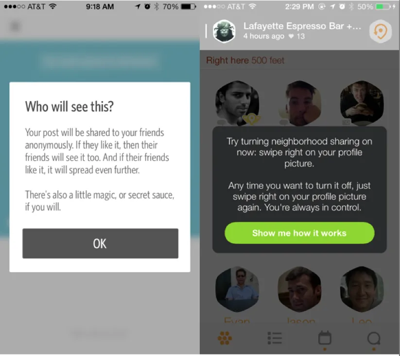
Sometimes notifications or additional information in the middle of using the app may help users better interact with the app. In this case, users might want to view the relevant information without losing their current place in the user interface. The popover design pattern can solve this problem in several ways:
- Popovers “pop-up” when the user performs a certain action or gets to a specific place in the app, showing the relevant information/controls associated with that particular action/place in the UI.
- The original content or place in the app is still visible in the background, but the popover gives you the option of tweaking certain things or learning about what comes next.
- The popover gets the user’s attention and provides important notifications where needed. At the same time, however, users can easily dismiss the popover and return back to whatever they were originally doing by simply tapping or swiping the screen
An example of popovers can be seen in the official TED app, which has a popover playback control that fades out the background, allowing users to interact with this control without losing their place in the content browser. Secret and Swarm use popovers to explain what will happen next if users continue with a certain action.
5. Slideouts, Sidebars, & Drawers
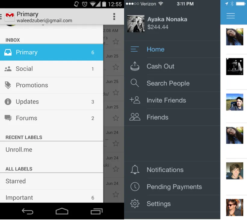
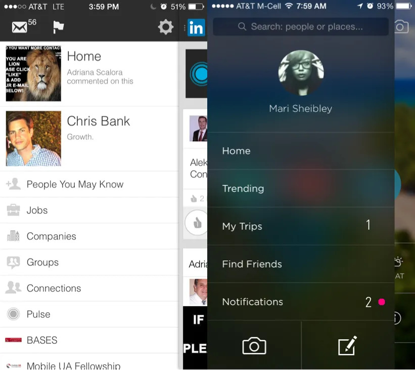
When compared with computers and TV’s, mobile phones have relatively small screens, which means that one of the challenges of mobile design is to fit a lot of information on a small UI. In order to avoid clutter of a large amount of information on a single screen at once, you can use slideouts, sidebars, and drawers to navigate between different parts of the app. These patterns are secondary sections of the application such as maps, chat, user profiles, etc., tucked away in collapsible “hamburger menus,” arrow buttons that slide out, or side drawers. In this way, users can interact with the most important information on each screen by selecting the section of focus from these hidden panels.
This content on design patterns is borrowed from one section of a longer, free ebook by UXPin – Mobile UI Design Patterns 2014: A Deeper Look at the Hottest Apps Today. Be sure to grab your own copy to learn about all the other major design patterns permeating the most successful mobile applications of today.

