Basic Design Elements and the Principles of Design
Good design isn’t about many years of practice and thousands of hours spent in graphic editor tools. The beauty of this craft is that it’s accessible to all, given that they have a surface level understanding of its principles and the basic design elements.
Luckily, hundreds of years of work with paintings and graphics have provided us with a series of vital rules that guide designers to this day.
In today’s article, we’ll take a closer look at these rules, along with the building blocks of design that will help you create great products with little effort or experience.
Create advanced prototypes that can be quickly translated into code. Try UXPin, an end-to-end prototyping tool for interactive design that helps you test not only the looks, but interactions too. Try it for free.
What is Design?
An essential first step on the journey towards good design is understanding what it is at its core. We often mistakenly believe that it has a decorative function — it’s meant to make things pretty and appealing. However, its spirit is much more pragmatic.
Design isn’t art per se. Some designers go as far as to insist that there’s pretty much no overlap between the two. While there’s a lot to debate in this viewpoint, one thing is for sure — the purpose of design is to solve problems. Furthermore, it can often be done to the detriment of beauty.
A design’s end goal is to find an innovative solution; this solution’s prettification is a secondary matter.
Therefore, it’s safe to say that design is the arrangement of visual elements that aims to solve a real-world problem. As designs become more complex, they evoke feelings that form experiences. Fundamentally, it helps us shape the world we live in and impact the way we perceive reality.
Basic Design Elements
Before we dive into the central principles of design, let’s explore its basic elements.
Lines
Lines are the most seamless and most powerful elements of design. They have a vast spectrum of functions and purposes. We use them to separate and organize space, outline and contour objects, emphasize certain elements, draw attention, and so forth.

It’s interesting how such a simple element can yield such a strong effect on our attention and have such a complex meaning in the modern visual grammar.
More importantly, we can curve and combine them to create rich meaning through different shapes and patterns due to how fundamentally simple lines are.
Lines can be thin and thick, horizontal, vertical, and diagonal, curved and zigzagged, dashed, and dotted — all of them can be used to convey meaning and shape experiences.
Source: https://www.pexels.com/photo/abstract-architect-architectural-design-art-323645/
Shapes
Everything is made of shapes which, in turn, are made of lines. We can deconstruct the world we live in into a series of basic geometric and natural forms.
Human cognition is odd. In our daily lives, we tend to forget that shapes surround us. Too often we fail to notice how they influence us too. Their effect on our psyche is partly due to our evolutionary upbringing — some shapes instill comfort, others make us cautious.
Rounder shapes like circles and ovals are generally associated with safety and children — throughout evolution, few round things could harm us.

On the other hand, pointier shapes make us think of danger. Throughout the early days of human evolution, they’ve forced us to direct our attention towards them.
A few million years forward, we’ve started using various shapes in typography and art. Human perception has fine-tuned the meaning of every kind of shape in part. Here’s a rough overview of a few of them.
- Squares and rectangles — they make us think of stability and safety. They’re balanced and mathematically sound;
- Triangles — often associated with power and energy. They often make us think of action, tension, and even aggression;
- Circles and ovals — typically associated with harmony, life, and permanence;
- Spirals — associated with nature, birth, evolution, and growth;
Color
Colors are equally mysterious. At their core, they’re nothing but electromagnetic radiation at different frequencies, yet they still have a very powerful effect on the human mind.
At the same time, it’s important to underline that there’s a lot of subjectivity to color perception. Our opinion on a certain color can be affected by various cultural, religious, geographical, and professional factors, along with plain personal preference.
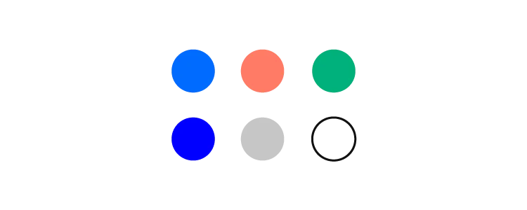
Fortunately, we can outline how certain color groups affect the majority of people.
- Warm colors (red, yellow, orange) typically instill a series of emotions ranging from calm and warmth to aggression and anger;
- Cool colors (blue, green, purple) can instill a range of feelings ranging from calm to sadness;
Plus, every color in part has its connotation and can evoke a complex spectrum of emotions. The most commonly used colors in modern design are:
- Blue — it’s extremely popular in web design and digital interfaces in general. It’s the predominant color on the web’s most trafficked websites. It’s twice as popular as yellow and red;
- Red — while not as popular as blue, red has a very clear function — push us towards action. This is precisely why it’s among the most used colors in calls to action on the internet;
- Yellow — can be perceived as cheerful and pessimistic, depending on the tone and hue;
- Green — mostly associated with nature and fertility. However, it can also be associated with money and greed;
Typography

Fonts are multifaceted. They communicate meaning through words and a mood through its characteristics.
When it comes to spoken language, we typically use a variety of factors to convey how we feel — rhythm, pitch, tone, gestures, and so forth. Typography also has a diverse set of characteristics that modulate the feelings that a text can evoke — size, weight, kerning, position, and so forth.
Due to how long we’ve been exposed to different typefaces, we’ve formed individual impressions about fonts. Some convey seriousness; others feel silly and unpresumptuous.
We use typographic differences to establish a visual hierarchy and outline the differences between kinds of information in design.
Source: https://www.typewolf.com/site-of-the-day/medium-2020
Larger, heavier fonts are often used for headlines. They set the tone for the text that will follow below. They aim to entice the reader by offering them a short glimpse of what they’re about to read.
Given that it’s common to keep headlines short, the fonts used for them will sometimes have more ornaments. Body text is meant to be slightly simpler to ensure legibility.
The rightness and wrongness of a type
There’s a myriad of things that you should consider when choosing the right font for your design.
Fundamentally, your choice should be guided by the message, the medium, and the audience you’re writing for.
Start with minimal diversity and gradually introduce the smallest amount of typographic contrasts necessary to guide a person through the classes of the information displayed.
Excessive complexity and lack of expressivity can make your design bland, unappealing, and illegible.
Bear in mind that your goal is to create unity through design. You’re on a mission to find the golden mean — the path between consistency and emphasis.
The Central Principles of Design
Now that we’ve gone through the basic design elements, we need to look at the principles that shape their relationship in a medium.
These principles differ based on their purpose and function. Things like contrast, repetition, and rhythm will help certain elements and components draw a person’s attention to them. Balance and variety are essential when it comes to creating designs that appeal to our senses.
More importantly, it’s essential to point out that all of these principles are tightly related to one another. Your goal as a designer is to achieve their harmonious coexistence.
It’s important to underline that you shouldn’t necessarily include all the principles in a design. However, using at least a few will guide you towards a more coherent and cohesive end-product.
Unity
Unity is a quality that a designer achieves once the product is finished. It’s important to point out that there are two kinds of unity — conceptual and visual.
The former is extremely important during wireframing. Conceptual unity is all about combining information for the user’s comfort and ensuring that they have to perform as little interactions while going from point A to point B.
The latter has to do with how things look. The idea behind it is to ensure the harmonious use of elements, colors, shapes, sizes, and so forth. Equally important design elements should have the same size or color and vice versa. A unified design allows to establish consistency and a clear visual hierarchy.
Contrast and similarity
Designers use these two principles to guide a person’s attention. Similarity is a powerful tool that allows us to create relationships between elements. Let’s take a quick look at a famous example of the similarity principle visualized by the Nielsen Norman Group.
According to the Gestalt principles in design, we tend to group things together based on their appearance. That is why people typically perceive the above image as four columns rather than three rows. We unify the sequences of triangles and circles in their own groups.
As a designer, you can use this principle to signify relationships between objects based on their shared features.
We generally use contrast to make things stand out. Our brains are hardwired to observe things that are out of place. These visual or structural outliers pique our interest and draw our attention.
Given that designs are created by people, we can immediately conclude that an existing contrast is there for a reason.
There are lots of basic ways you can create contrast. Here are a few of them:
- Texture — rough and smooth;
- Shapes — organic and geometric, rounded and sharp edges;
- Colors — difference in warmth, hue, and intensity;
- Scale and size — large and small objects;
Balance
Balance triggers a certain kind of satisfaction in us. It just “feels right.” It creates a sense of stability and composure. However, balance isn’t just one thing. There are a few kinds of balance that designers make use of — symmetrical, asymmetrical, mosaic, and radial. Each of them has a variety of subtypes.
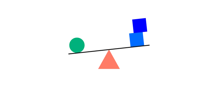
A lack of balance can cause multiple issues — it can misguide the user, causing them to feel disoriented or trigger a sense of visual discomfort. Therefore, a visually unbalanced composition will inevitably create unnecessary friction between the user and the medium.
As a result, a poorly balanced design will cause a scattered interaction with the product, causing some of the information to go unnoticed.
Hierarchy and emphasis
The main idea behind hierarchy is to ensure that a person follows a right order while processing the information in a design. Its purpose is to make sure that the elements presented in a medium are structured rationally, allowing the person to reach their final goal.
Hierarchy can be established by using a variety of visual parameters. Here are a few of them:
- Size — larger things are typically easier to notice. Therefore, they are considered more important;
- Color — things that have a brighter color stand out compared to the paler ones;
- Contrast — contrasting colors are more captivating;
- Alignment — misaligned elements are more eye-catching than the ones that are in order;
- Repetition — similar element features may indicate that they are related;
- Proximity — things that are placed close to one another typically seem related;
- White space — the more isolated elements are, the more attention they draw;
- Texture — complex textures typically draw more attention than the simpler ones;
A series of objects that lack prioritization will have too many accents. As a result, this can cause a rippled perception of the design. This chaotic quality feels irritating and frustrating. On the other hand, a lack of clearly emphasized elements may cause a design to seem dull and unappealing.
Rhythm and flow
Compositional flow determines how the eye is led through a design: where it looks first, where it looks next, where the eye pauses, and how long it stays.
Interaction layouts
To ensure that your design has a coherent flow, it’s essential to look into a couple of traditional layouts.

- The Gutenberg diagram — This layout is used applicable to cultures that read left to right. According to this pattern, reading gravity moves our attention from the top-left corner of a plain towards the lower-right corner. As a result, the other two corners get considerably less attention — they’re called fallow areas.

- The F-pattern — widely used in design for digital interfaces. Here, the eye movement starts at the top and moves from left to right. Then it moves onto the next line of text and continues its rightward movement. However, because modern users tend to skim over text, the lower lines vary in length, creating an F-shaped pattern.

- The Z-pattern — The logic behind this layout is that our eyes move in a Z-shaped pattern when exploring a visual medium. We sweep from left to right on the upper side of the plain, then make a diagonal transition to the bottom-left side, and finish by moving to the lower-right side.
However, these principles apply mostly to text-heavy designs. Once you start adding various graphical elements, the relevance of these patterns will gradually wither away.
Compositional flow
In order to guide our users in a scenario that isn’t covered by the layouts above, we need to make use of a variety of directional cues to guide our users. Here are a few of them:
- Repetition of elements
- Rhythm
- Implied action
- Diagonal lines
- Gestural lines
- Directional lines
- Perspective
- Subject matter of elements
- Gradation
These objects can be used to imply direction and guide a user’s movement.
Rhythm and repetition
Without repetition, there is no rhythm. Our brains are hardwired to seek patterns and similarities in our surroundings. In design, we can also use alteration and gradation to trigger pattern-like thinking.
There are three general kinds of rhythm:
- Regular — occurs when the size of the elements or the size of the space between them is predictable.
- Flowing — this rhythm is similar to the regular one yet does not imply an even size or distance between elements. Instead, it has to do with patterns we consider organic, similar to the patterns you’d see on a tiger.
- Progressive — occurs when an action’s progress is represented through continuous change in shape, color, etc.
White space
White space isn’t necessarily white; it can be of any color, texture, and so forth. Simply put, it’s the area that surrounds one or more elements of your design.
It’s a vital component for enhancing your text’s legibility and reducing cognitive fatigue and friction between the beholder and your design.
White space has become especially relevant in the last 15 years, as designers started moving away from extremely crammed and disorienting interfaces.
Please take a look at Arngren, an old version of a Norwegian classified site that immediately throws us back into the ’90s (not in a good way). It’s a perfect example of a near-total lack of white space. Take a second to think about how it makes you feel:
Now, compare it to Apple’s 2020 homepage:
Why use white space?
The effective use of white space has a wide array of benefits. First off, it directs a person’s attention towards a specific object. It’s another way of establishing a visual hierarchy. It allows us to guide a person through a design and direct their attention to its most essential elements.
Secondly, it increases the chances that a person will interact with it. At the end of the day, that’s why we design things — we want people to use them to solve important problems.
Thirdly, a lack of white space can take its toll on the eyes and brain. Let’s go back to Arngren and Apple for a second — imagine you’re looking for something on the first site; a microwave oven, for instance. Try to be mindful of how complicated this task appears. Furthermore, pay attention to how tiring this experience is to the eye.
Last but not least, white space ensures legibility. By not cramming your text in a tiny area, you’ll make it significantly more accessible for people to read it.
Here’s an example of text that has very little white space:
And an example of text that has plenty of it:
Variety
Variety is a vital part of design that aims to arouse visual interest. Designers typically use it to counteract excessive unity — when things are too monotonous and bland. An uninteresting design will often fail to communicate which elements are more important and deserve a person’s attention.
There are many ways we can use variety to liven things up:
- Lines — varying weight, angle, or length
- Shapes — changing up the kind of shape (i.e., amorphous or geometric) as well as the size, color, orientation, texture, etc.
- Colors — using diversity in the hue, value, or saturation
- Values — varying the lightness or darkness
- Textures — is it rough or is it smooth?
Use Principles of Design in Prototyping
On the surface, design is in continuous change — it never stays the same. However, its principles and elements are timeless.
More importantly, it’s a good idea to think of them as parts of a large system. Improving on variety might harm balance. Making a design too unified, might cause it to seem dull and unappealing.
One thing is for sure — by continuously taking them into account, you’ll be able to create well-thought-out designs, whether you’re a beginner or a pro.
Create prototypes that are as interactive as the end-product. No code required. Use UXPin and dive into the world of advanced prototyping. Try for free.
